Why it matters
Around one in twelve men and one in two hundred women have some form of colour-vision deficiency. In a game where six players are told apart by colour, that's roughly one player in every few tables. If two tokens look the same to them, the game is broken for them.
The palette
| Crew member | Colour | Hex |
|---|---|---|
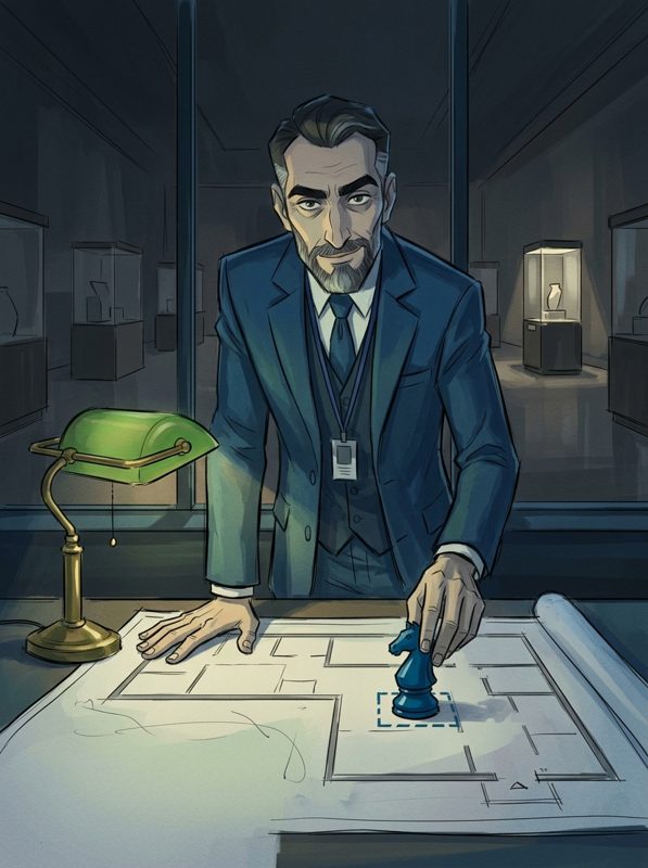
| Selim, the Brain | Deep blue | #0072B2 |
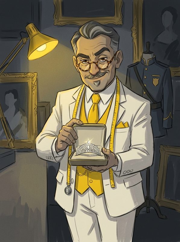
| Rafael, the Merchant | Vivid yellow | #FFD000 |
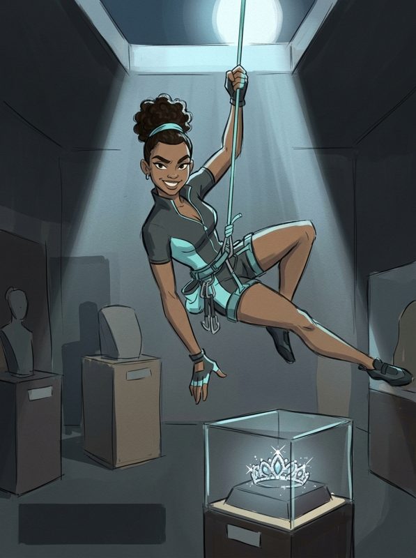
| Adriana, the Cat | Light turquoise | #5CE1E6 |
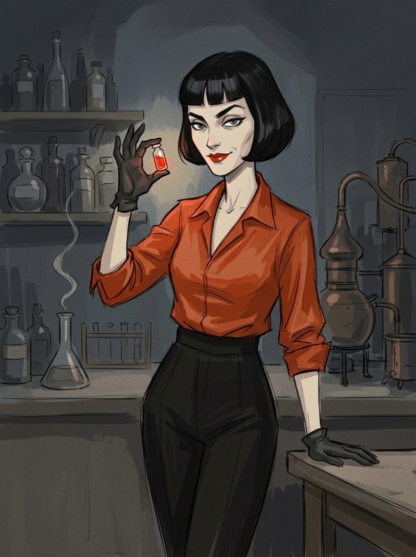
| Céleste, the Alchemist | Vermilion | #D55E00 |
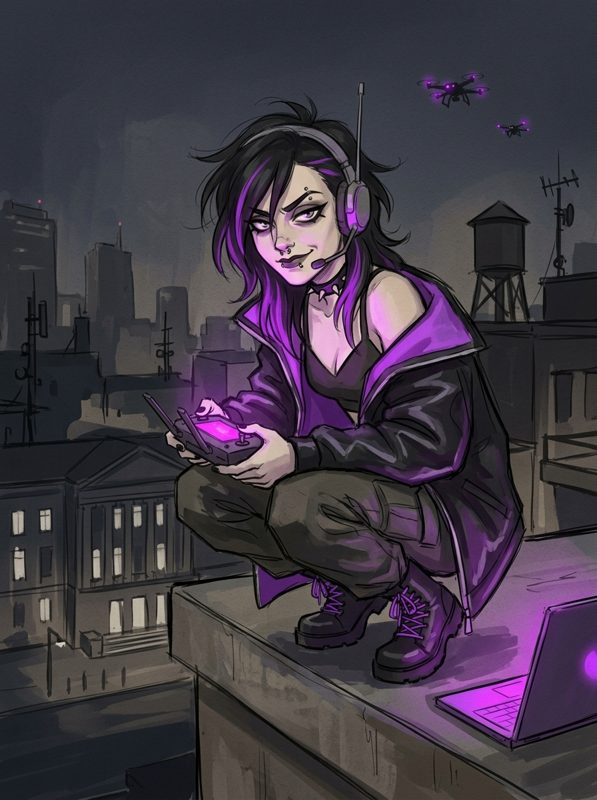
| Lena, the Ghost | Neon purple | #BF40FF |
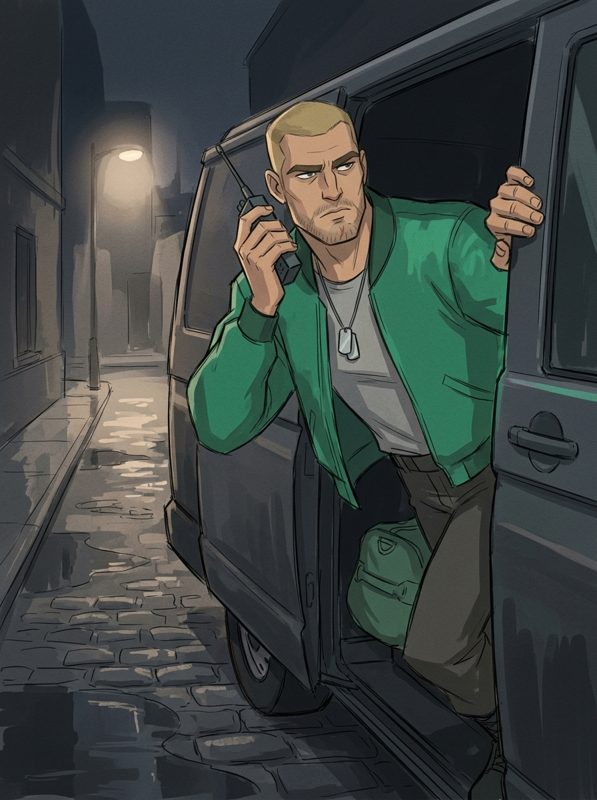
| Marcus, the Captain | Forest green | #009E73 |
The starting point was the Okabe–Ito palette, a set of colours chosen for colour-blind readers. We then adjusted three of them to suit the characters: a brighter yellow, a lighter turquoise and a neon purple for the hacker.
How we tested
- Simulate. We converted every colour as it would appear with protanopia, deuteranopia and tritanopia, using published simulation matrices (Machado et al., 2009).
- Measure. For each simulation, we calculated the perceptual distance (CIELAB ΔE) between every pair of the six colours.
- Set a floor. We wanted every pair, in every simulation, comfortably above the point where colours start to look alike.
Results
The closest pair was Selim's blue and Marcus's green under tritanopia, at a ΔE of about 17. Every other pair, in every simulation, was further apart. CHECK · re-run the test on the final hex values before publishing.
Beyond colour
- Portraits on tokens. Every token shows the crew member's face, not just a coloured dot.
- Names everywhere. The case log and cards always say the name.
- Contrast. Text on cards is dark ink on cream, readable at small sizes.
Questions
Can I change the colours? Not yet. CHECK · an accessibility setting is not in the plan.
Do I need to know the colours to play? No. Names and portraits are always shown.